Fyde

Client: Fyde
Role: Design Lead, UX/UI
Category: On-chain Treasury Management
Focus: End-to-end screen design for Escrow, Vault, Referral and LRT
Timeline: Aug 2023 – Nov 2024

Overview

Fyde is a liquid vault protocol on Ethereum. Users deposit ERC-20 tokens into a diversified protocol treasury and receive TRSY tokens representing their stake. The protocol actively manages the portfolio, allocates liquidity, and generates yield.

My Role & Approach

As Design Lead I owned UX and UI across all phases of the product — from the initial Escrow launch to Vault, Referral, and LRT. For each phase I produced UX flow diagrams before any screen design, mapping every user path and edge case. This gave the engineering team a clear spec and let us catch interaction problems before they became build problems.

Flow Diagrams

Every feature started with a full UX diagram — happy paths, error states, and edge cases documented.

UX/UI Design

End-to-end screen design for Escrow, Vault, Referral and LRT — desktop and mobile, all states covered.

Dev Handoff

Structured component annotations, interaction specs, and handoff documentation delivered to engineering for each phase.

Phase 01

Escrow & Deposit Flow

A 3-stage journey — Deposit, Freeze, Claim — where assets are locked and reviewed before protocol allocation. I designed diagrams, connected wallet states, in-progress deposits, success confirmations, and error handling.

Key challenge

Communicating the freeze period without triggering user anxiety

Solution

  • Add a Tip section above the fold that explains all steps of the process
  • Add a clear status timeline with contextual copy at each step
  • After the tokens are deposited, add contextual copy for the Freeze and the Claim period
  • Add a dedicated Tokens deposited and to be claim with contextual copy

Deposit period

Freeze period

Claim period

Tip section (Quick Tutorial)

“As a first-time depositor, I don’t know what happens to my tokens after clicking Deposit — so I need step-by-step guidance before committing, to avoid panic when my wallet balance drops.”

Tip #1 in the Quick Tutorial widget explicitly addresses this moment of uncertainty.

Deposit period timeline card and other elements

“As a user who has already deposited, I have no idea where I am in the Deposit → Freeze → Claim cycle or when I can come back — so I feel like my funds are lost and I file a support ticket.”

Dedicated timeline card with period countdowns and status copy at every stage in other elements.

Phase 02

Vault & Core Interface

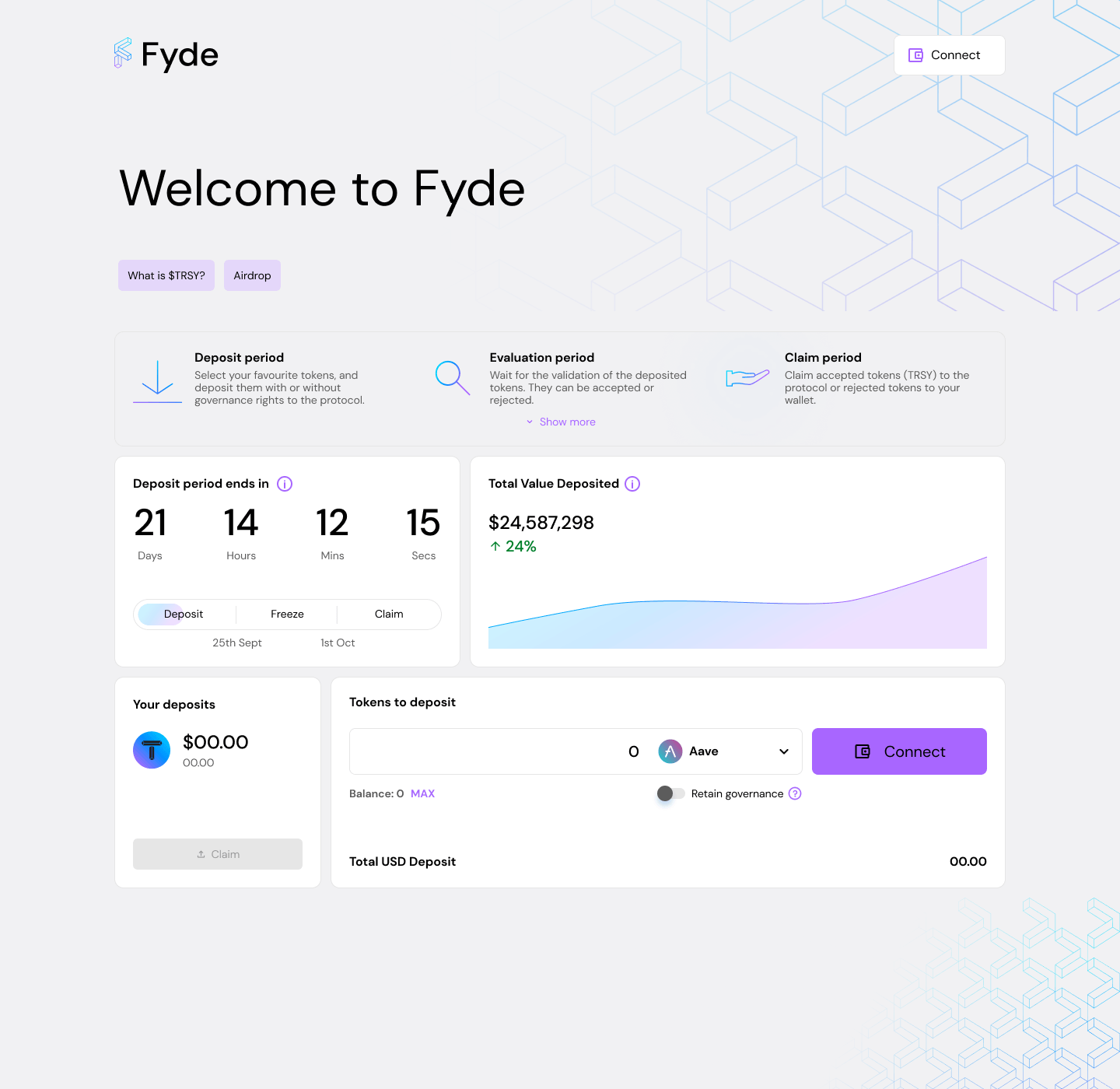
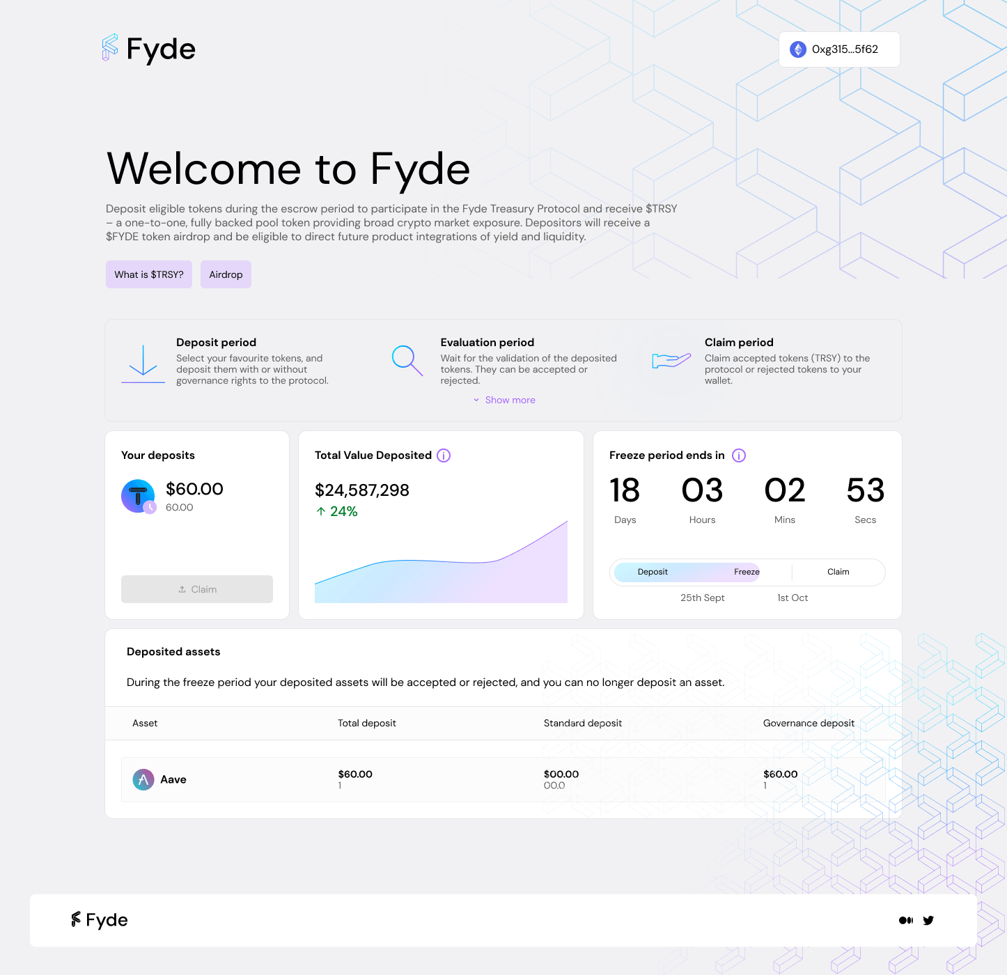
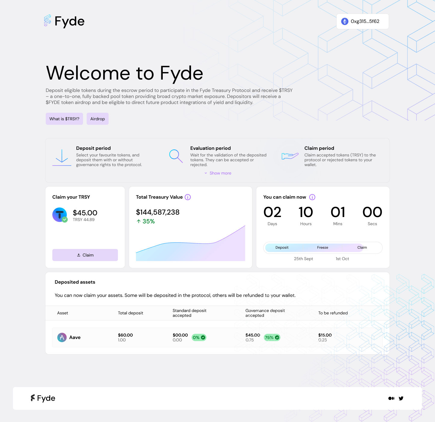
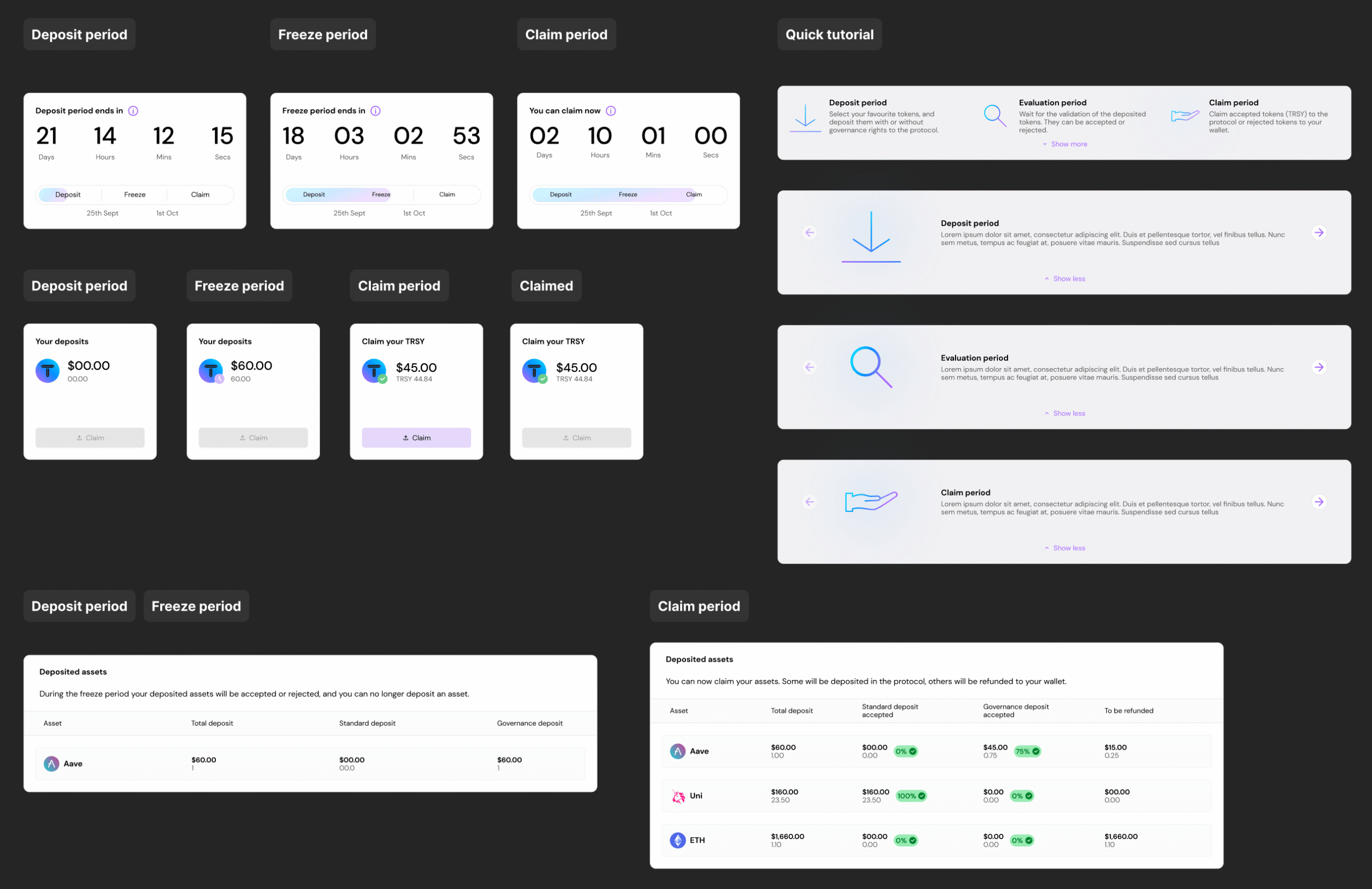
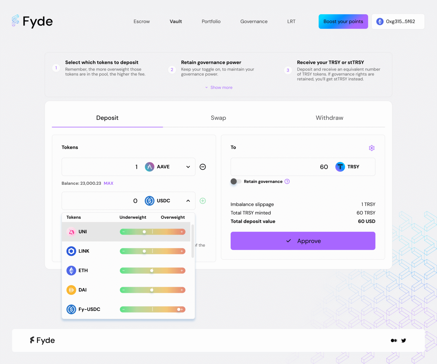
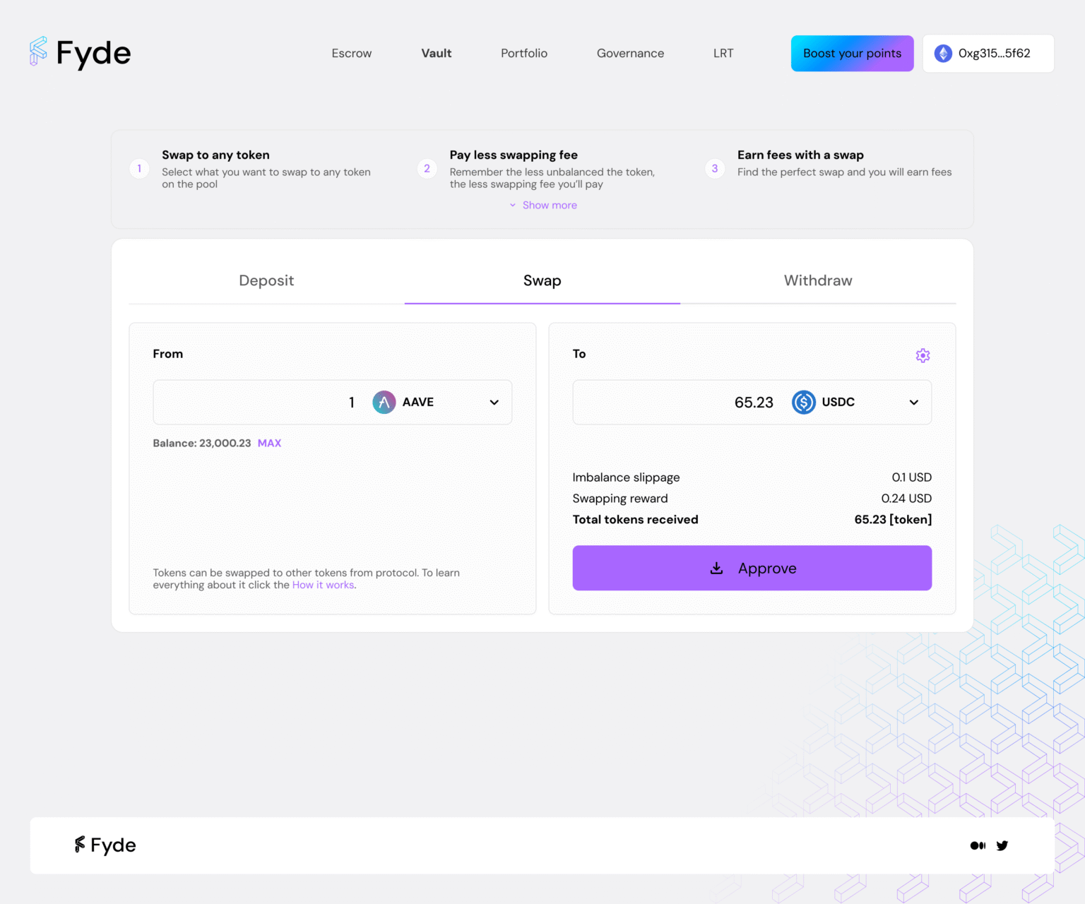
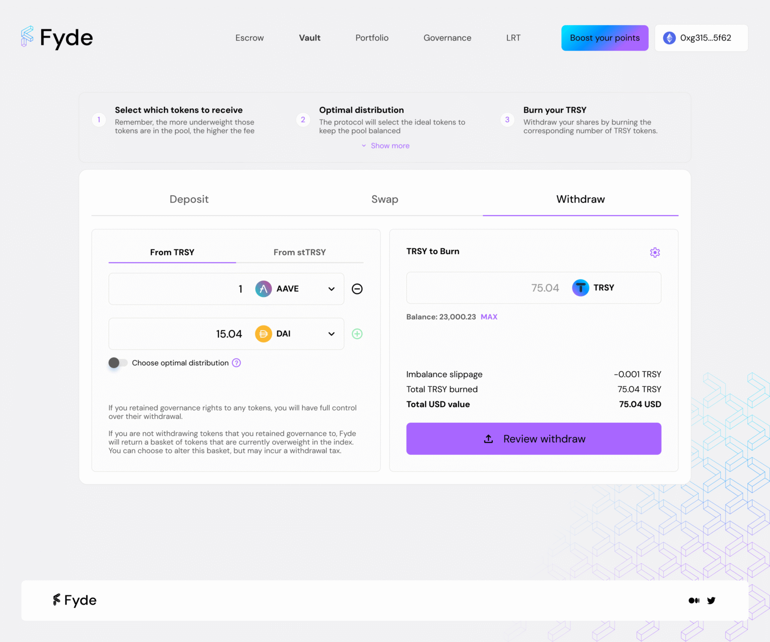
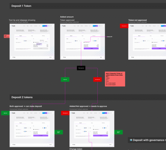
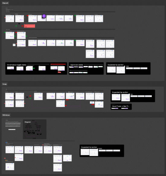
Multi-token deposits, swaps, and governance. The primary interface — users deposit multi-token positions, withdraw, swap, and exercise governance rights. I led UX/UI for all four interaction modes: deposit, withdraw, and swap. Each section add a dedicated tip section on top to have all the information of the mechanics for the user.

Green means cheaper — the insight from testing

Early explorations of deposits used a neutral percentage bar to show token weight, but user testing sessions revealed a clear problem: participants couldn’t immediately tell whether a position was good or bad for their wallet.

The key insight: the bar needed to encode intent through color. Green on the underweight end (pay less fee), red on the overweight end (pay more). Users responded to green as “go ahead” and red as “caution” without reading any label — exactly what we needed for a fast decision. The inverse logic will be applied for withdraw tokens.

3 approaches tested in user sessions:

Percentage labels only — users didn’t know if high % was good or bad

Bar without color — faster scan, still ambiguous direction

Color-coded bar (green → red) — immediate comprehension, no labels needed